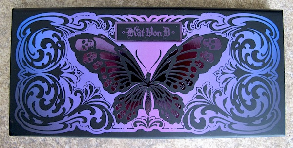
Kat Von D Chrysalis Eyeshadow Palette
Confession: I am a total sucker for Kat Von D’s eye shadow palettes. The combinations of shades are always right up my alley, and the shadows are usually very high quality. As a palette hoarder, picking this one up the second it came out was a no-brainer. The Kat Von D Chrysalis Eyeshadow Palette is butterfly-themed and was created to allow for endless ways to transform your eyes. You know, like a series of metamorphoses.
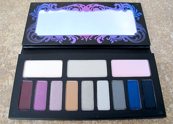
Kat Von D Chrysalis Eyeshadow Palette
The 12 shadows are housed in a cardboard case with a mirror. There are 3 larger base shades and 9 accent hues. The shades are arranged in 3 sets of 4 to give you an idea of how to put them all together on your face, but obviously, you are not limited to only using them that way. There is a nice variety of matte, shimmer, and sparkle in this palette and, as usual, the shadows are incredibly soft. The palette is described as a cool-toned palette, but I feel some of the shades lean a little warm, which is perfect for me. Chrysalis is available at Sephora and retails for $46.
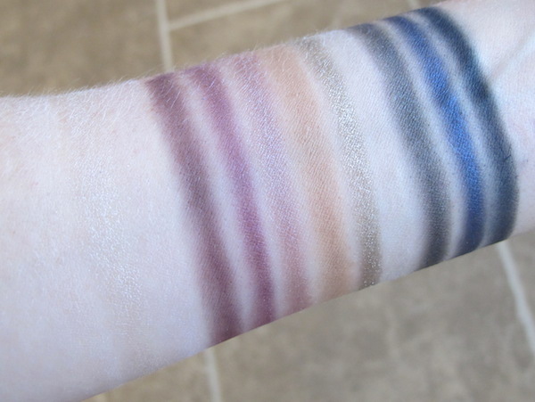
Kat Von D Chrysalis Eyeshadow Palette Swatches
Note: The first 3 are barely visible on my arm.
Lifelike-A matte cream.
Lunar Lights-A pearl gray. This one works beautifully as a highlight.
Lucid-A sparkly, light pink. The texture is a bit chalky and it had a ton of glitter fallout.
Hybrid Moments-A matte deep purple that leans a little red. This one kicks up lots of powder that will make a bit of a mess if you’re not careful.
Mezzanine-A sparkly violet.
Transition-A pearl mauve.
Glasswing-A matte caramel. This is very buttery, but patchy and difficult to get an even blend. I have to do lots of layering to get a uniform color across my lids.
Melancholia-A pearl silver that leans a little warm. Highly metallic and sparkly. It looks very dry and gritty in the pan, but the color on this one is really intense without having to put forth much effort, and it’s incredibly buttery and easy to blend.
Black Milk-A matte gray. This has the same issues as Glasswing, only a thousand times worse. It’s a nightmare to try to get an even application. Basically impossible.
Graphic Nature-A pearl charcoal.
Entombed-A pearl blue. Kicks up a ridiculous amount of powder and difficult to blend.
Tornay-A matte navy. Not as buttery as some of the other shadows, but no major issues blending.
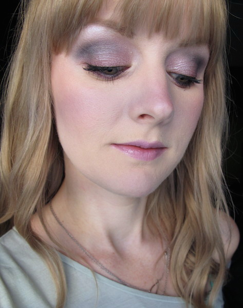
Here’s how it looks:
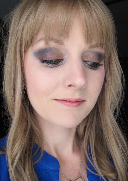
Kat Von D Chrysalis Eyeshadow Palette in Lunar Lights, Lucid, Mezzanine, Transition, Tornay
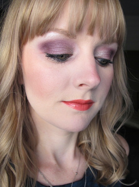
Kat Von D Chrysalis Eyeshadow Palette in Lunar Lights, Lucid, Hybrid Moments, Mezzanine, Transition, Melancholia
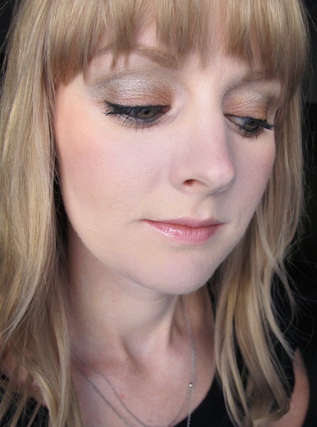
Kat Von D Chrysalis Eyeshadow Palette in Lifelike, Lunar Lights, Melancholia, Graphic Nature
Kat Von D Chrysalis Eyeshadow Palette in Lifelike, Lunar Lights, Glasswing, Melancholia
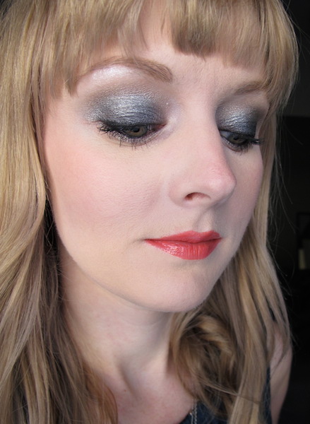
Kat Von D Chrysalis Eyeshadow Palette in Lifelike, Lunar Lights, Glasswing, Melancholia, Entombed
Overall, I’m a bit disappointed with this palette. The quality just isn’t there with the majority of the shadows and I had a very difficult time creating more than just a handful of looks. After about a week, I felt trapped into doing the same looks over and over again. Even if I was using different combinations, they looked nearly identical to others I had already tried because some of the shades are so similar to each other. Black Milk is completely unusable, and I kept trying to avoid some of the other shadows (mostly the mattes) because they don’t blend well and are very messy. This palette has amazing reviews and lots of people seem to really love it, but I just don’t see it. Since it isn’t as versatile and easy to use as some of my other palettes, I definitely don’t see myself picking it up very often unless I am specifically going for the plum or navy shades.


